Jakarta, Indonesia
Category:
Visual Design, UI Design
2021
Project Year
Training made easy and practical.

Project Brief
The Design Process
Consistency and clarity.
With the problem defined, I sketched Fitable’s core flows around two pillars: consistency and clarity. I wanted the visuals to speak with comfort, so that users would not feel bored with the monotony of it through regular use. The whole vibe should feel structured / organized, but it should still feel humane enough in its design.
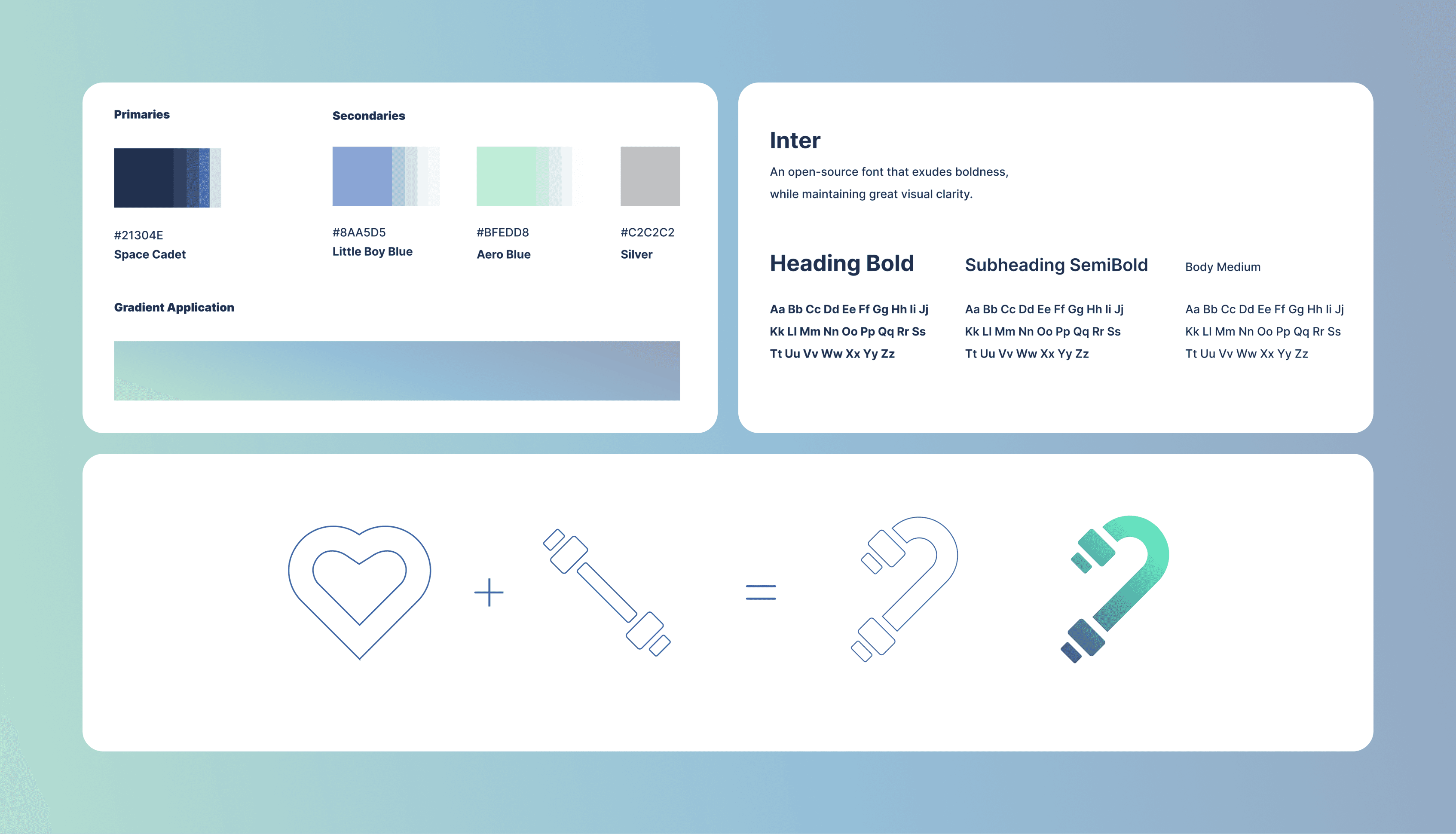
Choosing the color palette
I settled on a cool‑to‑warm gradient, with a dominant navy blue melting into mint green to strike the perfect balance between energy and calm. The navy anchors the interface, lending it a sense of reliability and clarity, while the mint injects a fresh, motivational vibe that nudges you toward your next workout. By using subtle tonal shifts rather than jarring contrasts, Fitable feels both sleek and approachable, guiding users’ eyes through their training data without visual fatigue.
Selecting the typeface
For typography, I chose Inter, a versatile, geometric sans-serif renowned for its clarity at small sizes and friendly character shapes. Its open letterforms and consistent stroke widths ensure that numbers, labels, and microcopy remain legible even when users are glancing mid-exercise. Inter’s modern neutrality aligns perfectly with Fitable’s ethos: serious about performance, yet human in tone.
Training with a heart
The Fitable logo fuses a heart icon with a dumbbell silhouette. I got the image of a literal “wholehearted training” put into a single, friendly mark. I overlaid vector shapes in Illustrator until the curves and weights aligned just right, then applied the same gradient palette for instant brand cohesion. The result is an emblem that feels dynamic yet balanced, signaling that Fitable is as much about motivation and care as it is about measurable progress.
From here, the app began to take shape.
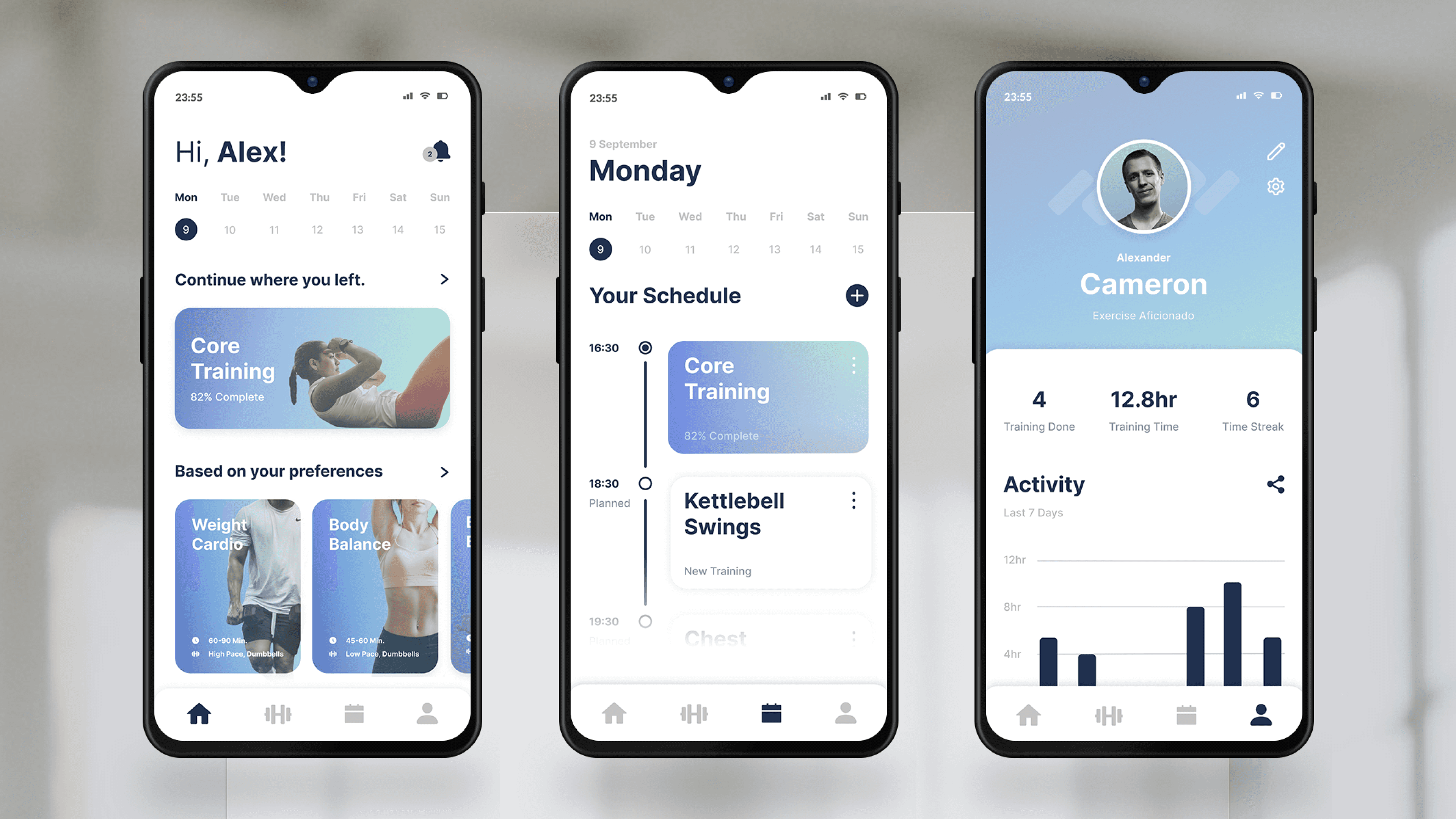
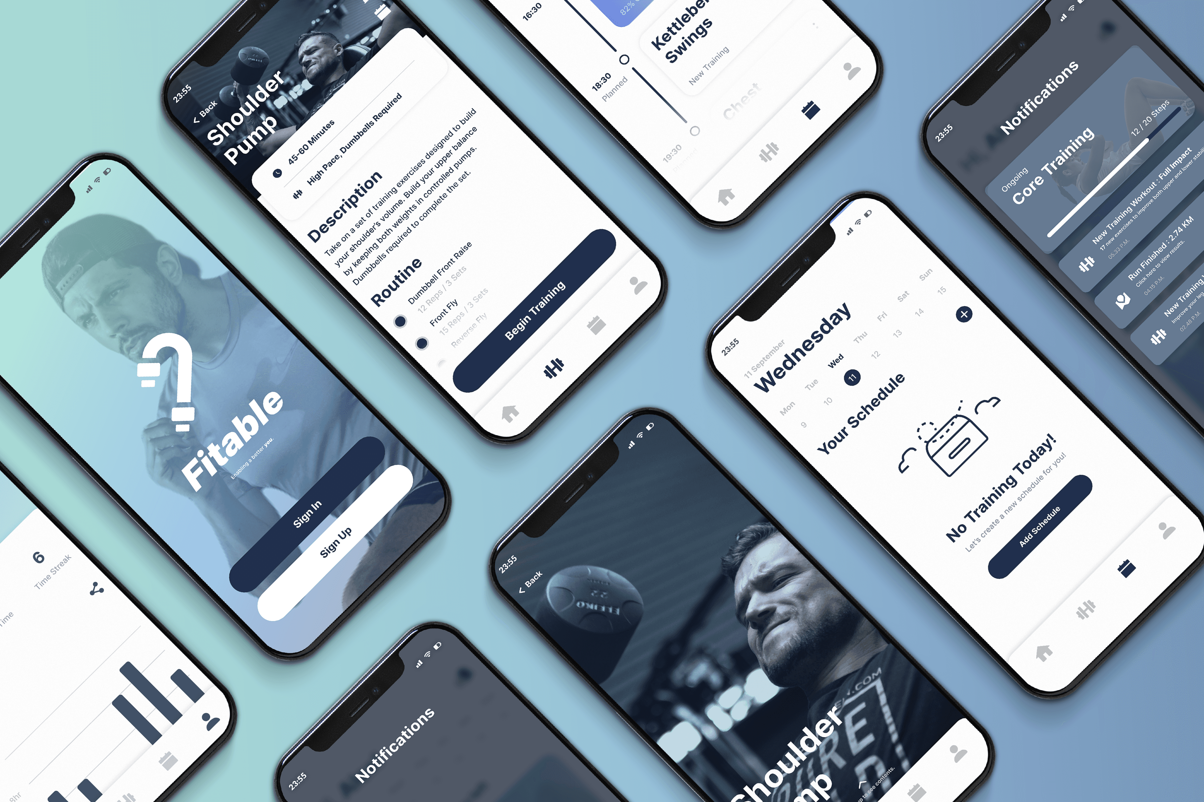
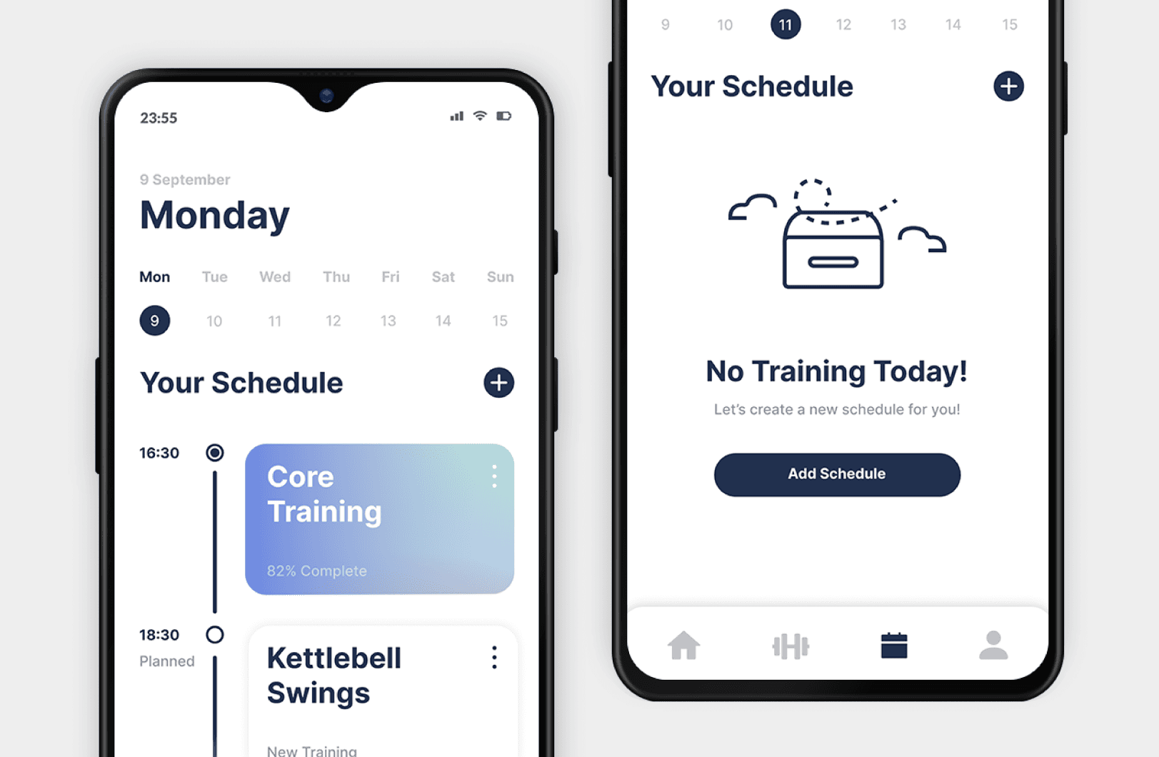
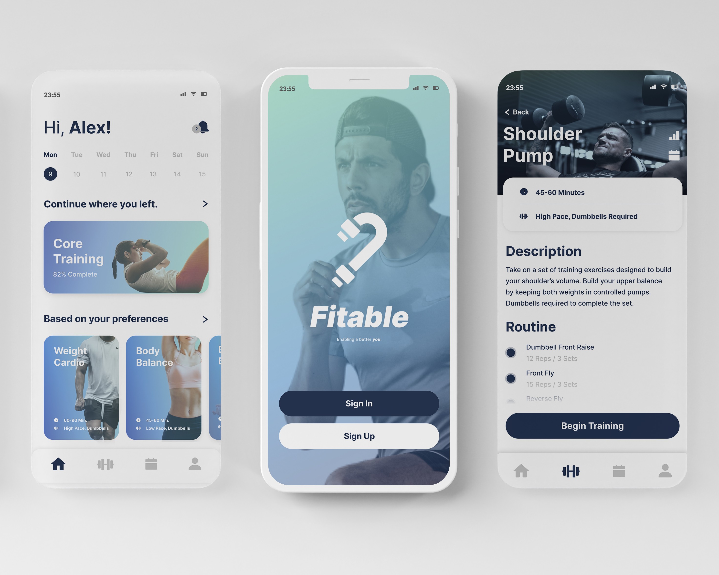
The command center of things
After sorting out the visuals, I created the Main Menu Dashboard so that when you open Fitable, you’re greeted with a clean, card‑based overview of your day’s workout, quick‑stats, and shortcuts, all on one screen. I added a Training Schedule tab where you can drag to rearrange upcoming sessions or tap to swap routines in real time. And because I know how important progress tracking is, so complementing those two is a Profile tab that lays out your consistency streaks, total volume lifted, and personal bests, so you always know exactly where you stand without digging through menus.
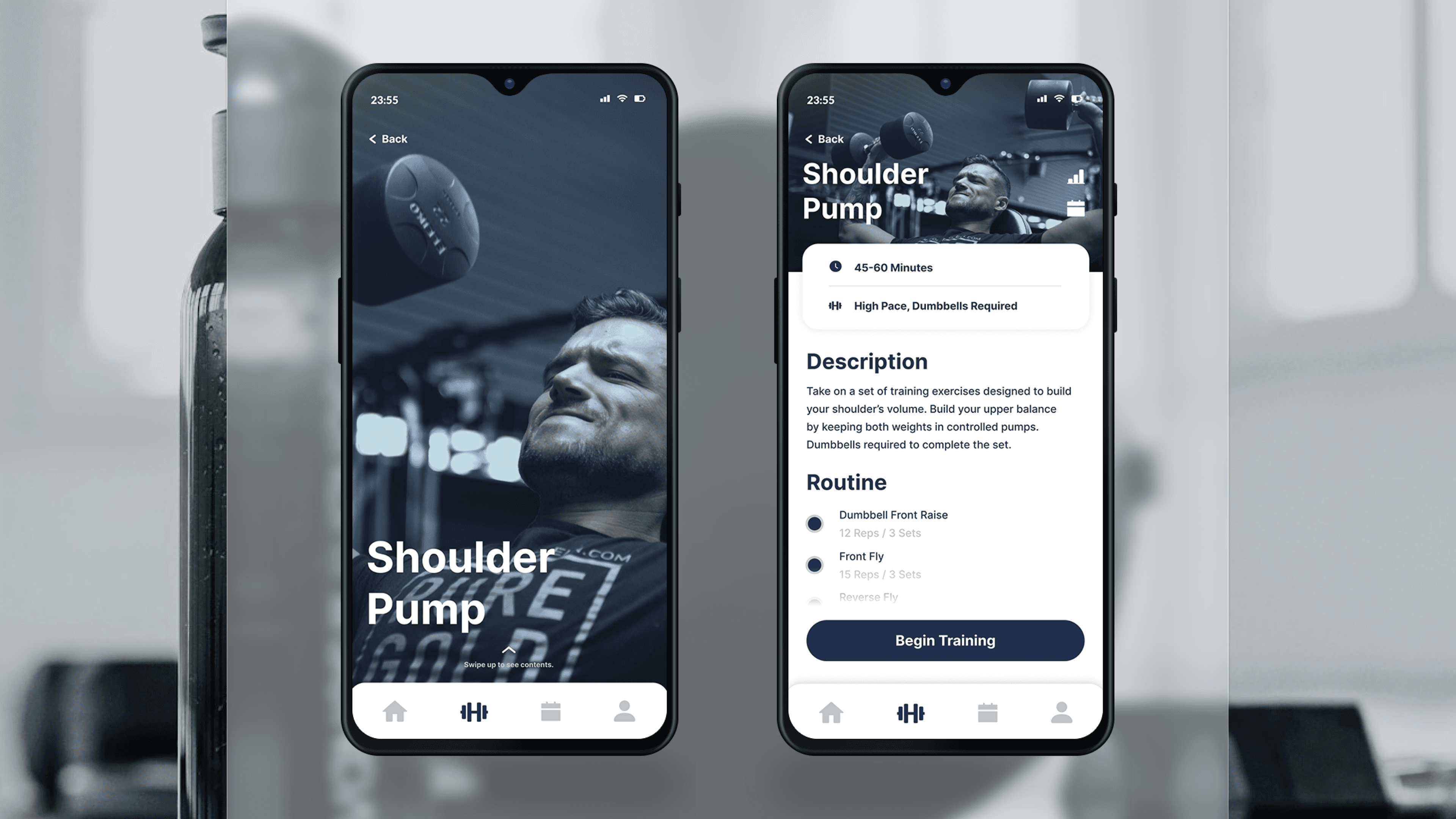
From demo to demonstration
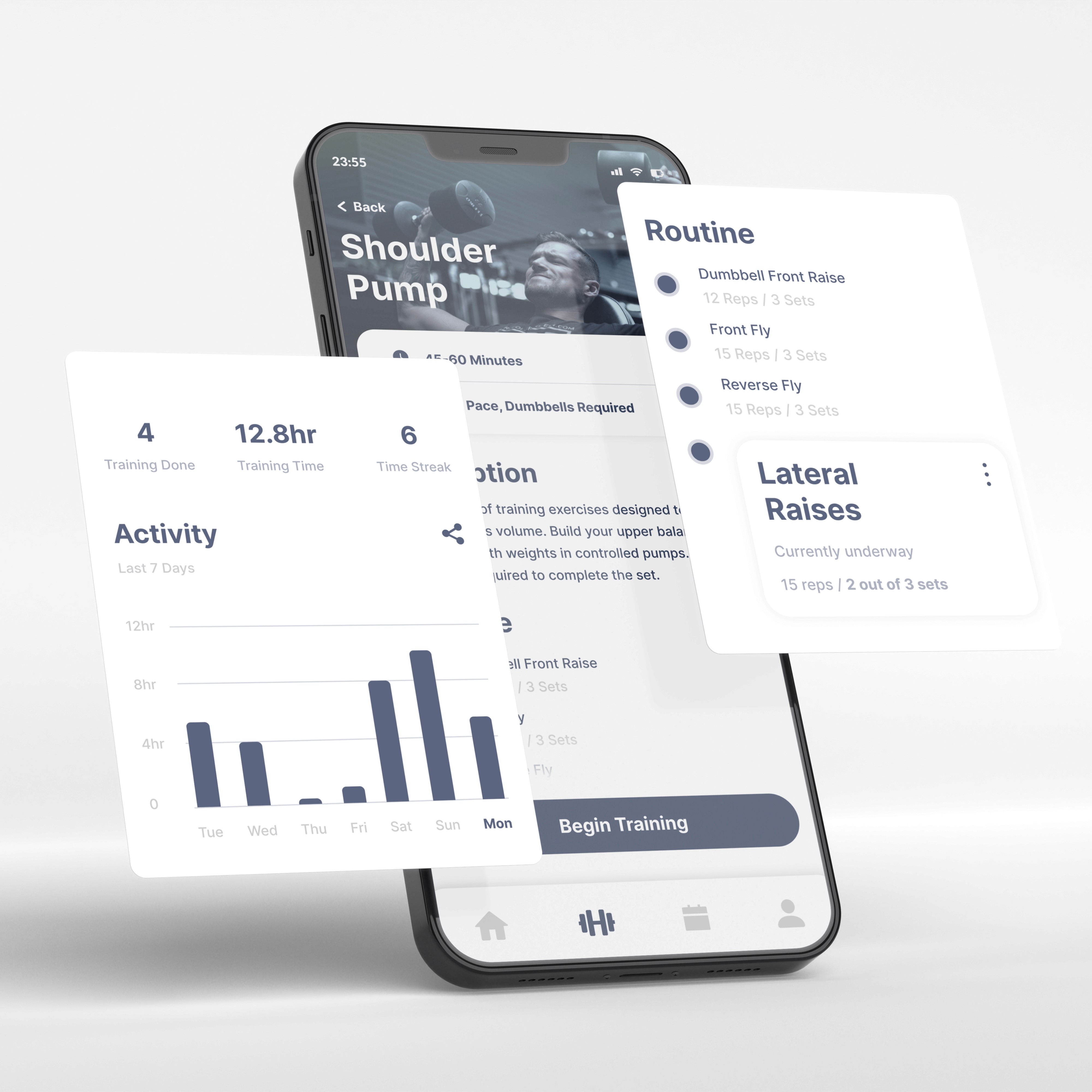
Any of the main menu exercise cards can be expanded to a Routine View. Each routine appears as a sequence of individual exercises, so users can immediately know what they're training. Every time a user begins a training routine, a Step‑by‑Step Guide will be present to highlight each exercise in order and providing inline instructions, demo GIFs, and recommended tempo.
As you complete a set, a simple tap advances you to the next move, while an auto‑running rest timer ensures your pacing stays on point. It’s like having a coach in your pocket, walking you through every rep without any extra swipes.
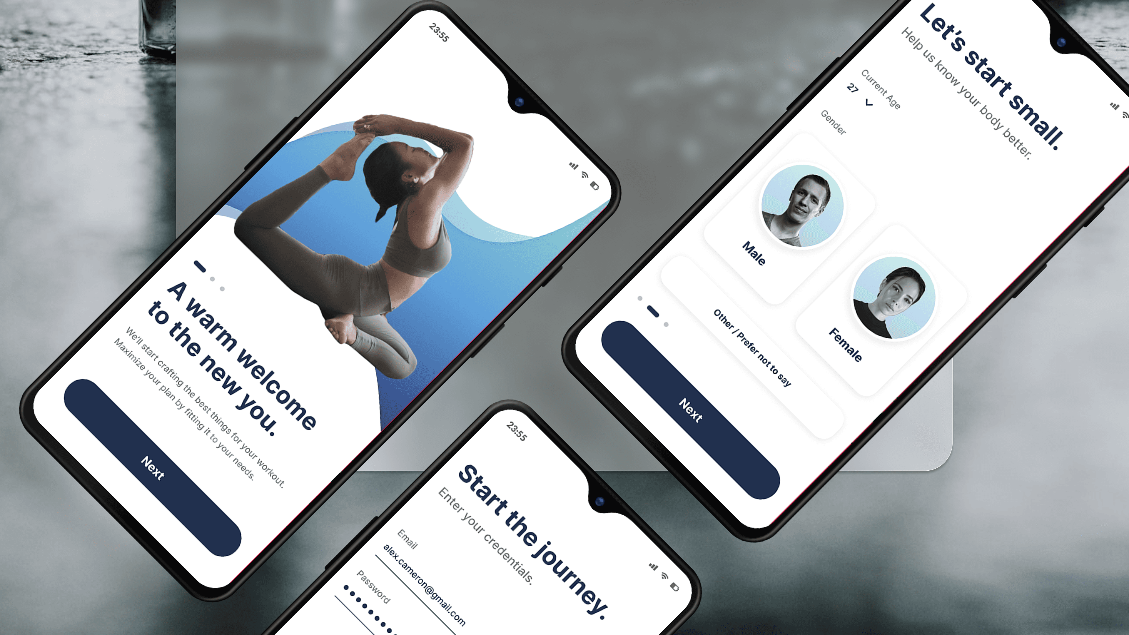
Fast lane onboarding
Recognizing that clunky sign‑ups kill momentum, I streamlined Fitable’s KYC Flow to get you moving in under a minute. I added both login and sign-up options, followed by only asking for your age, gender, and fitness goals. Everything else can be done after registration to let users begin without too much hassle upfront.