Southeast Asia
Category:
Visual Design, Product Design
2025
Project Year
Building noble causes with a region-wide impact.

Overview

The Scope
A rebrand with the future in mind
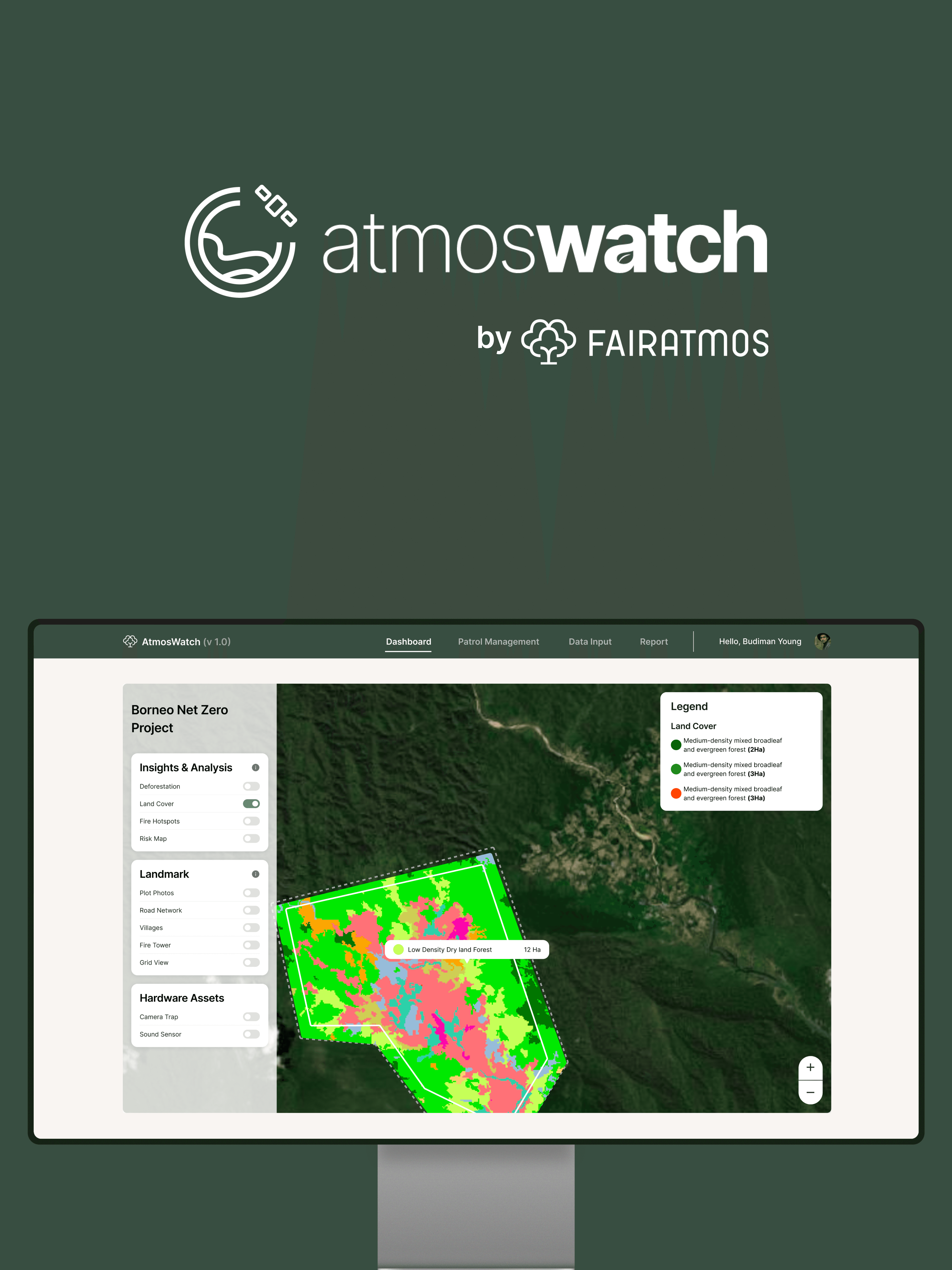
The challenge is then, to create a system that works both physically and digitally. Fairatmos is a carbon project enabler /operator by nature, but its digital products demand the necessary futureproofing on both ends of the spectrum. Since the company has previously had the track record of being perceived as an NGO or a state-owned enterprise, this helps to clear the distinction as well.
In this regard, My role as Fairatmos' sole creative hand is unique, as I wore many hats: from its primary Visual Designer to its de facto Creative Strategy Lead. I am, however, a Product Designer first and foremost. This specific role lets me spearhead this rebrand initiative not just for physical collaterals, but also with clear responsiveness and accessibility purposes in mind. As one key stakeholder at Fairatmos said it best: "Make sure the whole thing looks good on a banner, but also on camera when someone takes a picture of it."
What to improve
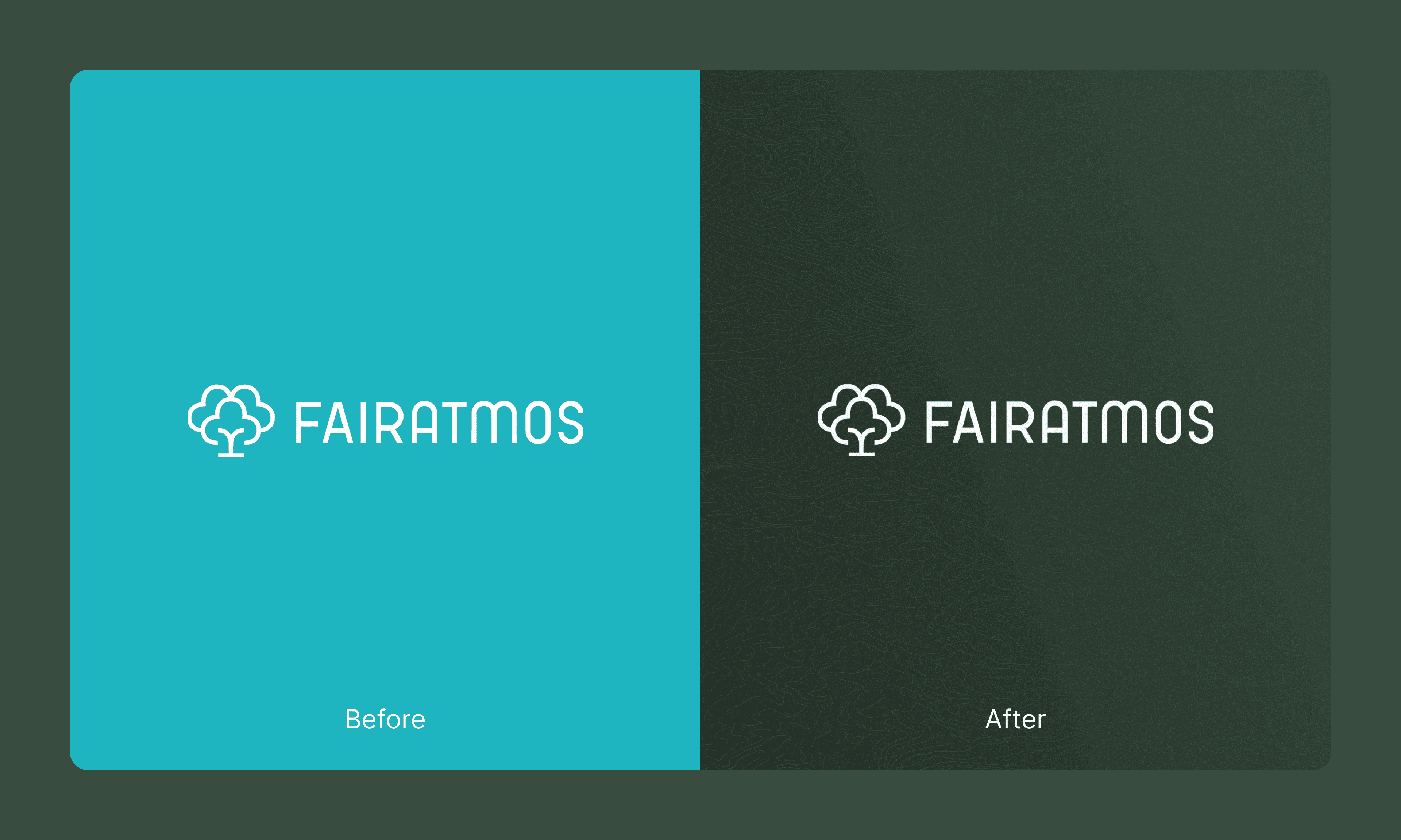
To that end, I decided to warp the norm by rebranding the overall tone and look. Fairatmos previously used a color palette of teal and cream, which worked decently in digital media but not so much in print.
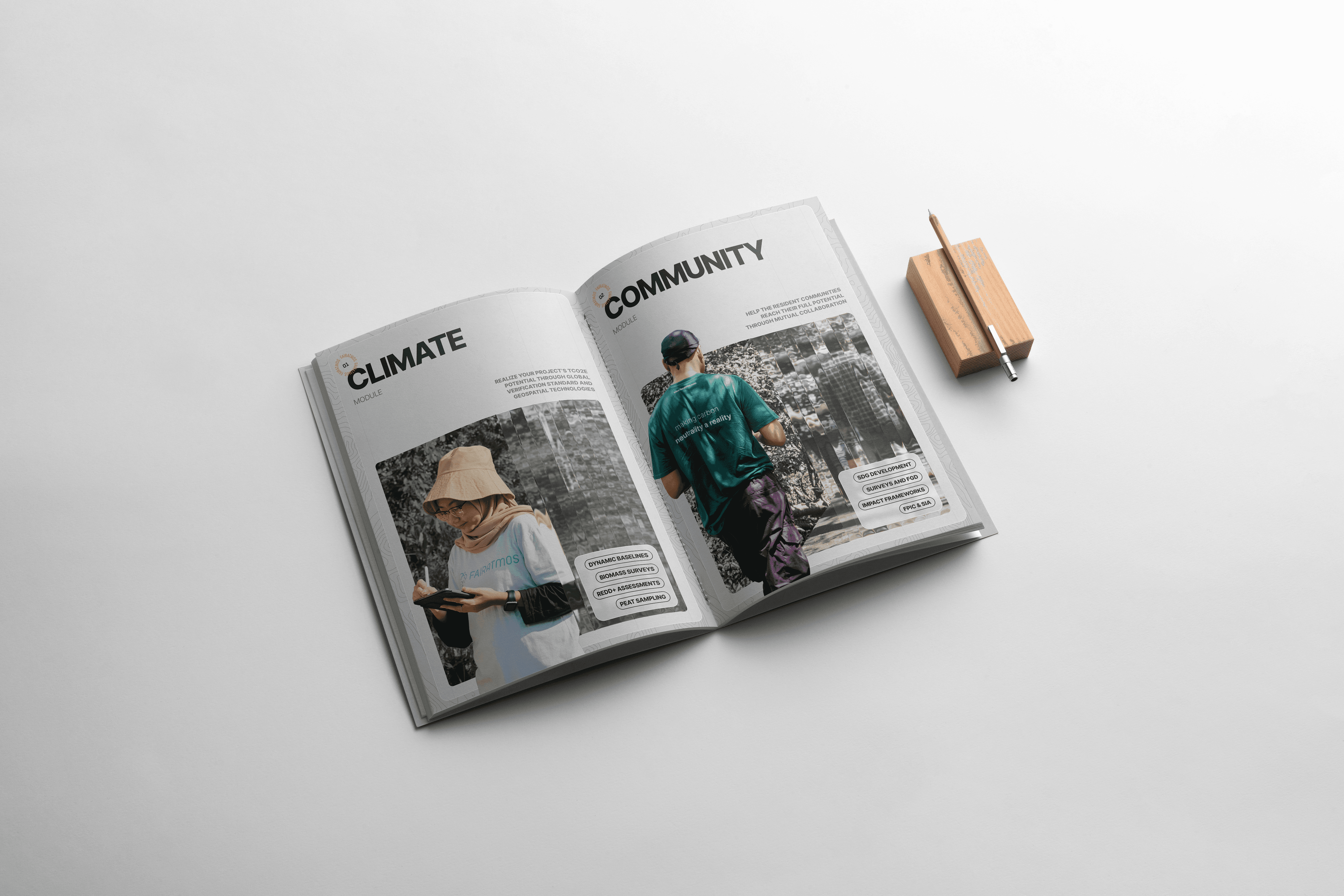
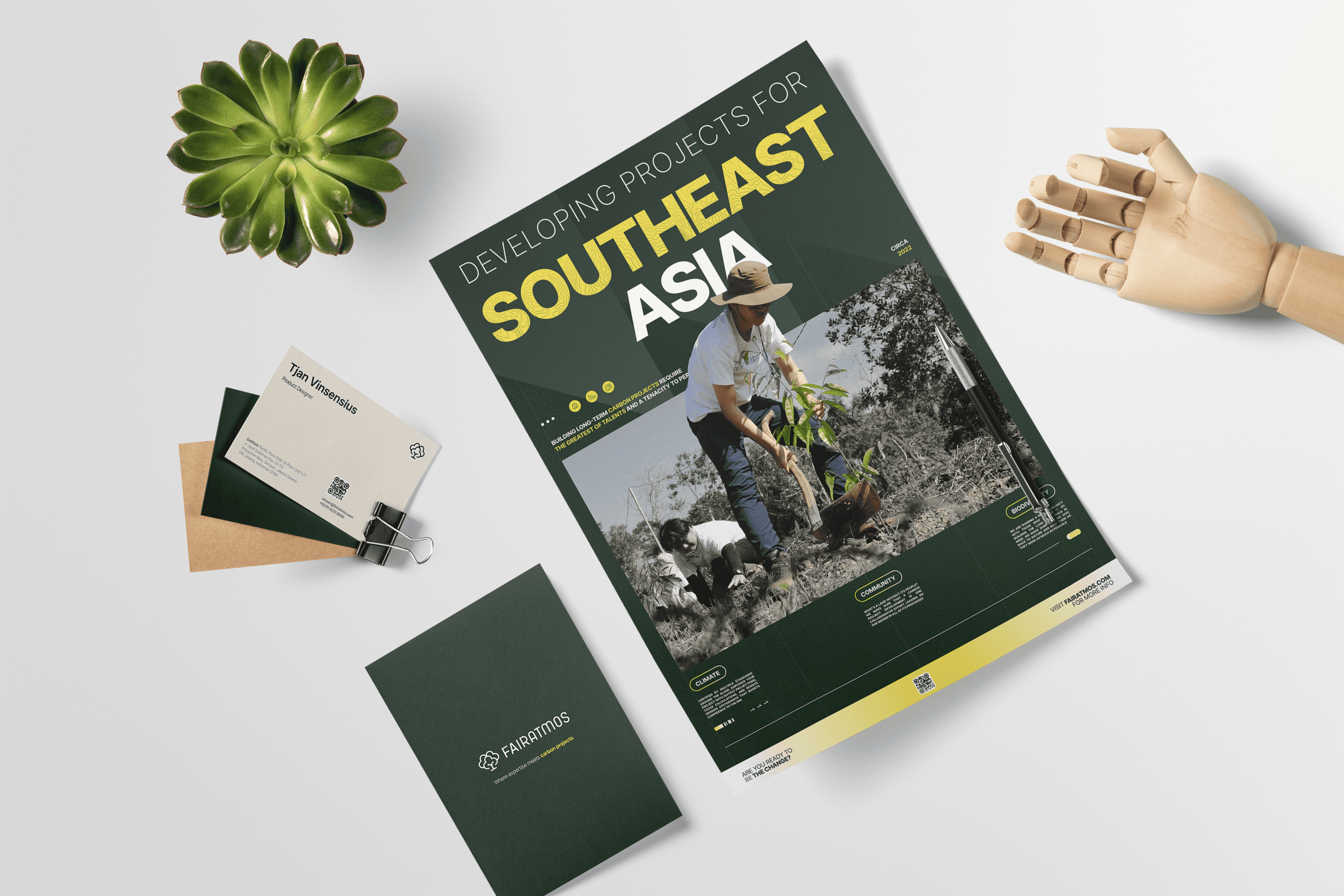
This new one emphasizes a down-to-earth feel, using a shade my team and I call “Hijau Green” (it loosely means “Green Green,” but hey, it’s catchy enough!) alongside a contrasting, vibrant yellow that is intended for eye-catching materials. It’s also a perfect color for digital CTAs and is most often seen on buttons across Fairatmos’ site and products. Complementing this are gradients, visual accents, and supergraphics that combine our community-rooted spirit with technological prowess, which is best shown through the usage of topography patterns.
A retrospect on brand positioning
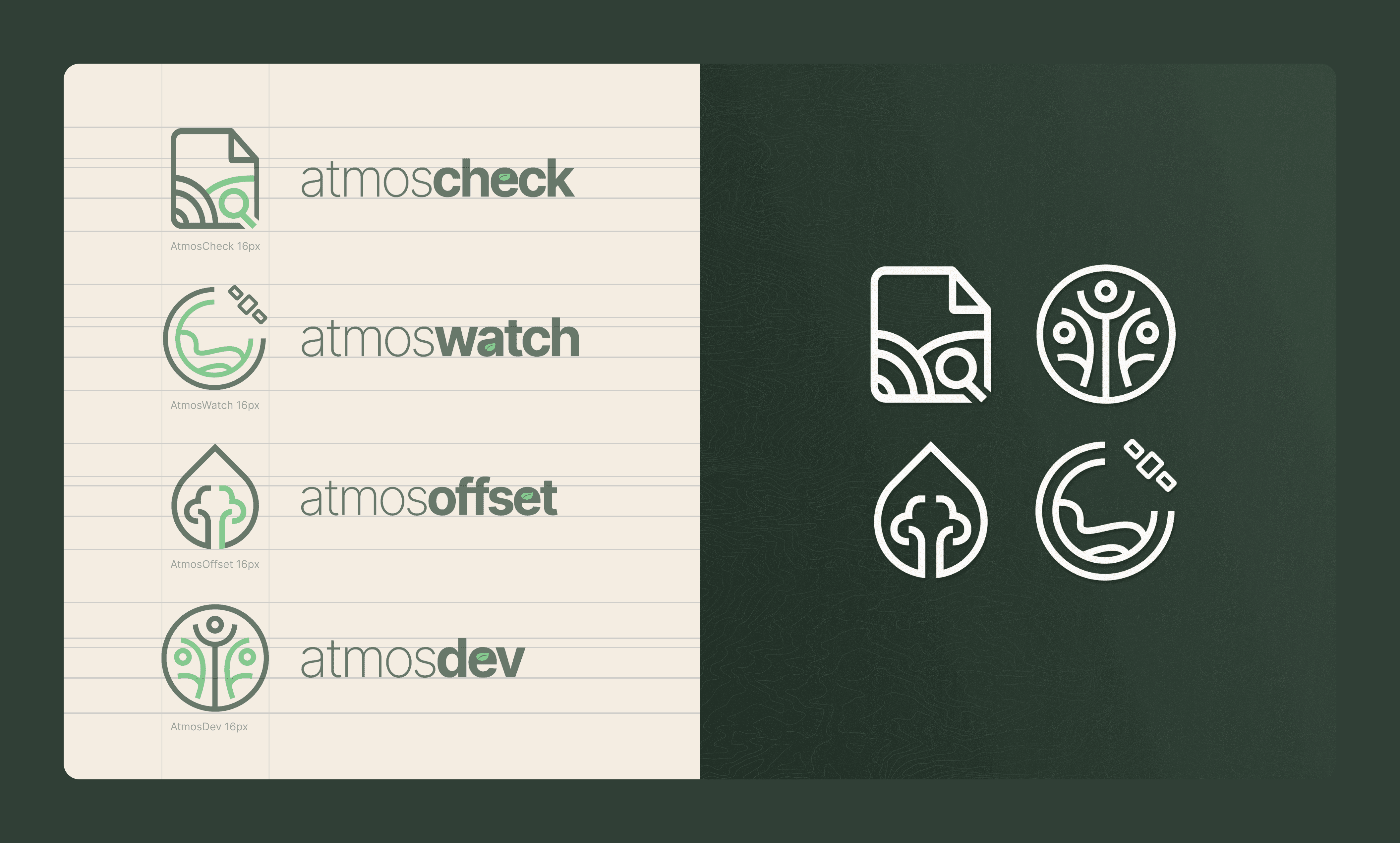
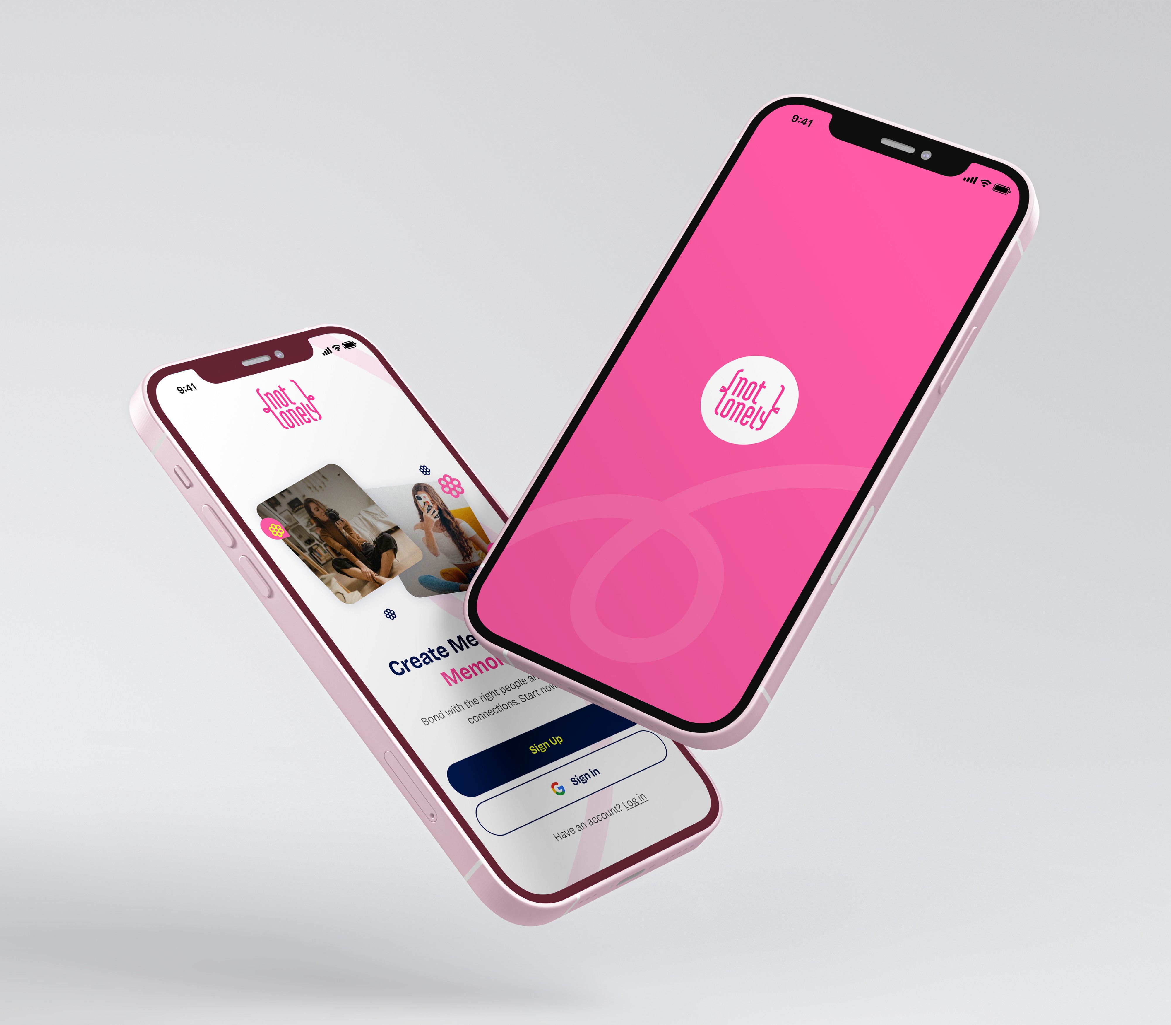
Fairatmos positions its brands as a part of one big extended family. All of its products have "Atmos-" prefixes to indicate that they belong to us. Our digital carbon project eligibility checker tool, for example, is aptly named "AtmosCheck". Similarly, the program designed to help investors finance the right project is named "AtmosFund".
This naming convention serves as the primary baseline in developing all four logos for the Fairatmos family tree. By using the uniformity as a common denominator, we created a set of logos that feel cohesive and show the company's uniqueness while still being flexible enough to be used across different media.
Match made in heaven
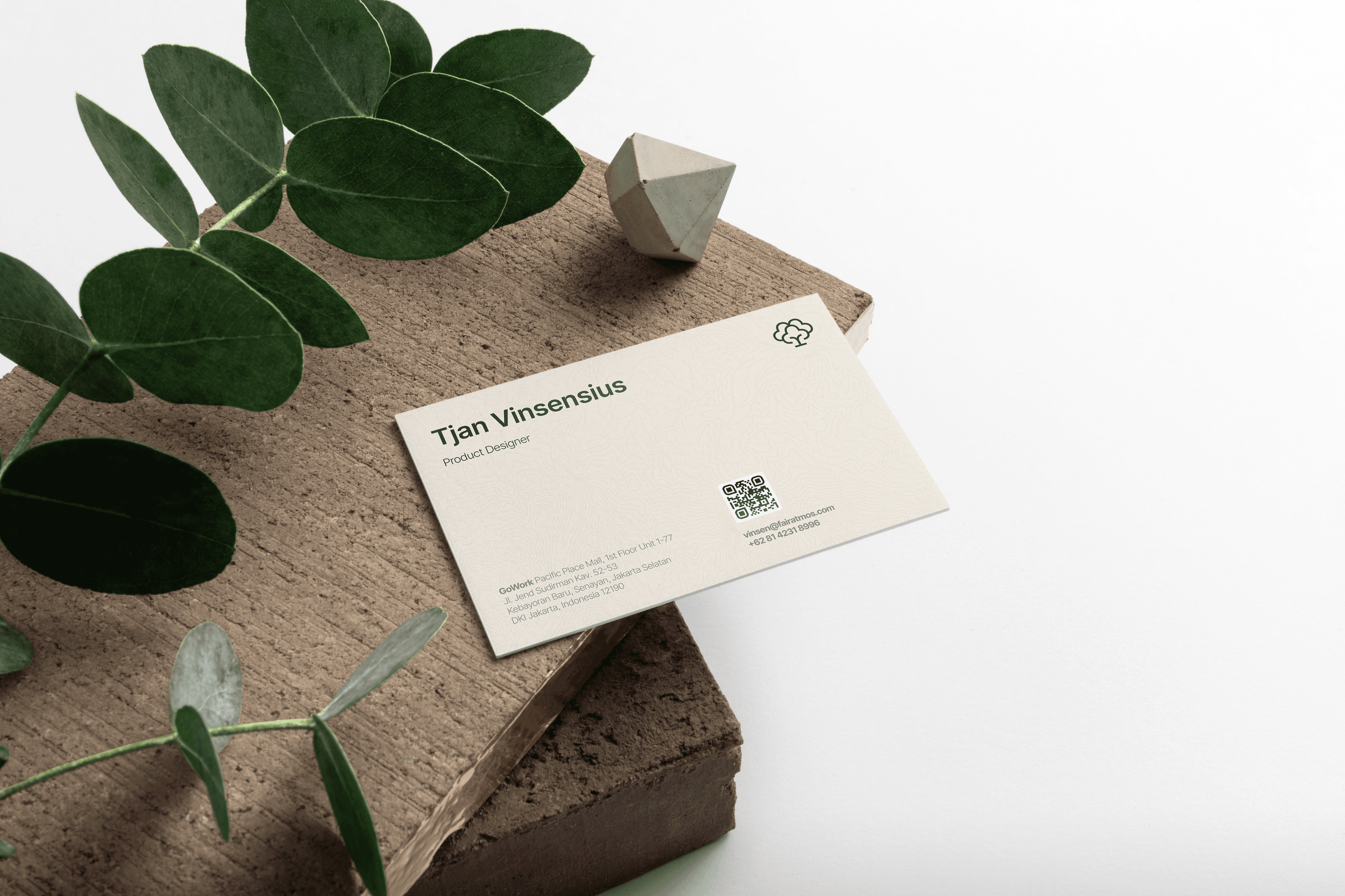
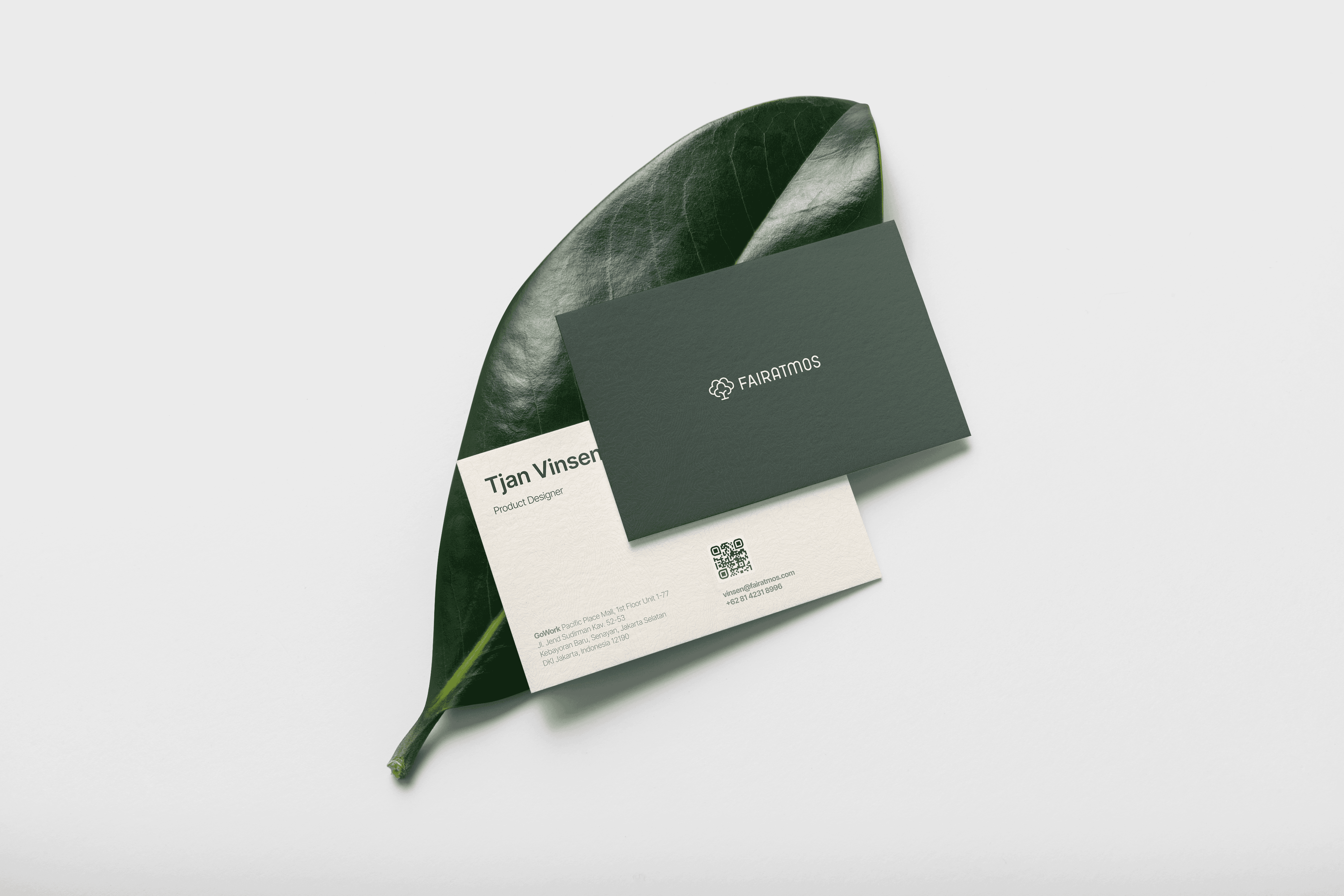
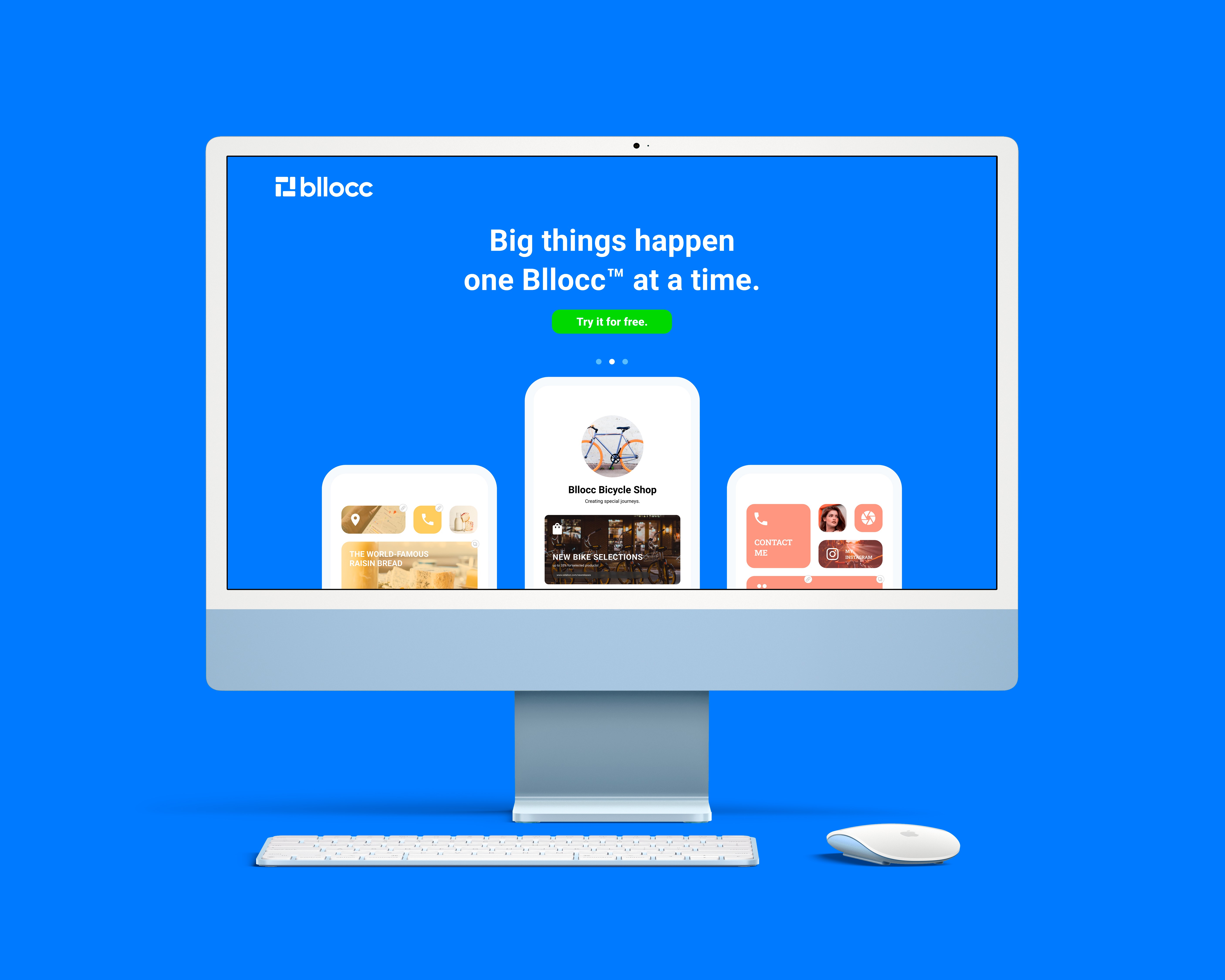
This whole toolkit is engineered to flex across screens and print alike. To this day, this is what the company has done, and this has since become the standard for anything Fairatmos produces that has visuals in them. From pitch decks and presentations, to brochures, flyers, and research reports.
What about on the digital side? Well, these assets actually plug straight in into our design system. Fairatmos has never had a robust one previously, and this served as a starting point that eventually also sprouted various components. It has since been spread through all of our products, albeit far from perfect and is still continuously evolving to this day.